Tehdia
Context
Overview
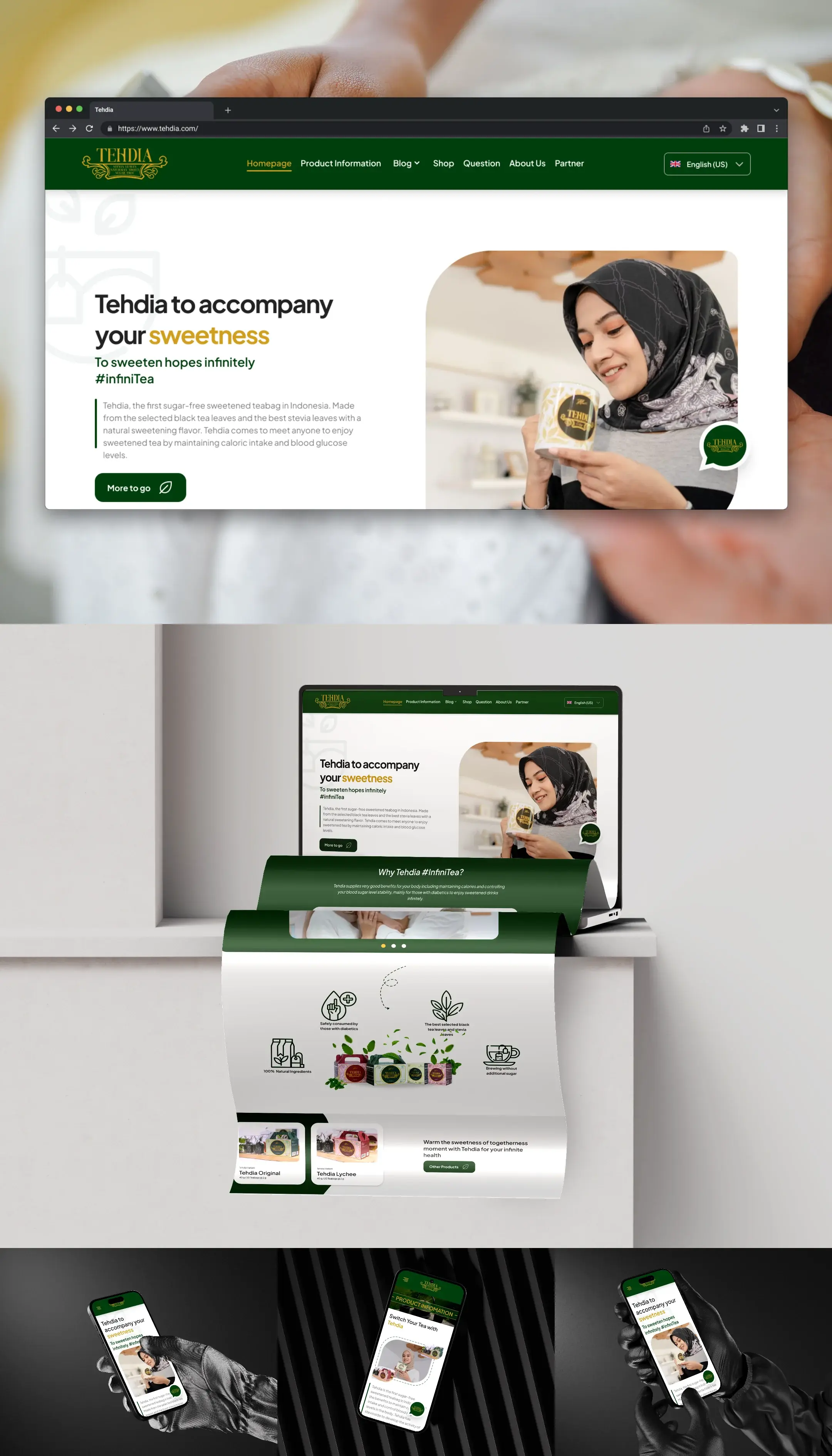
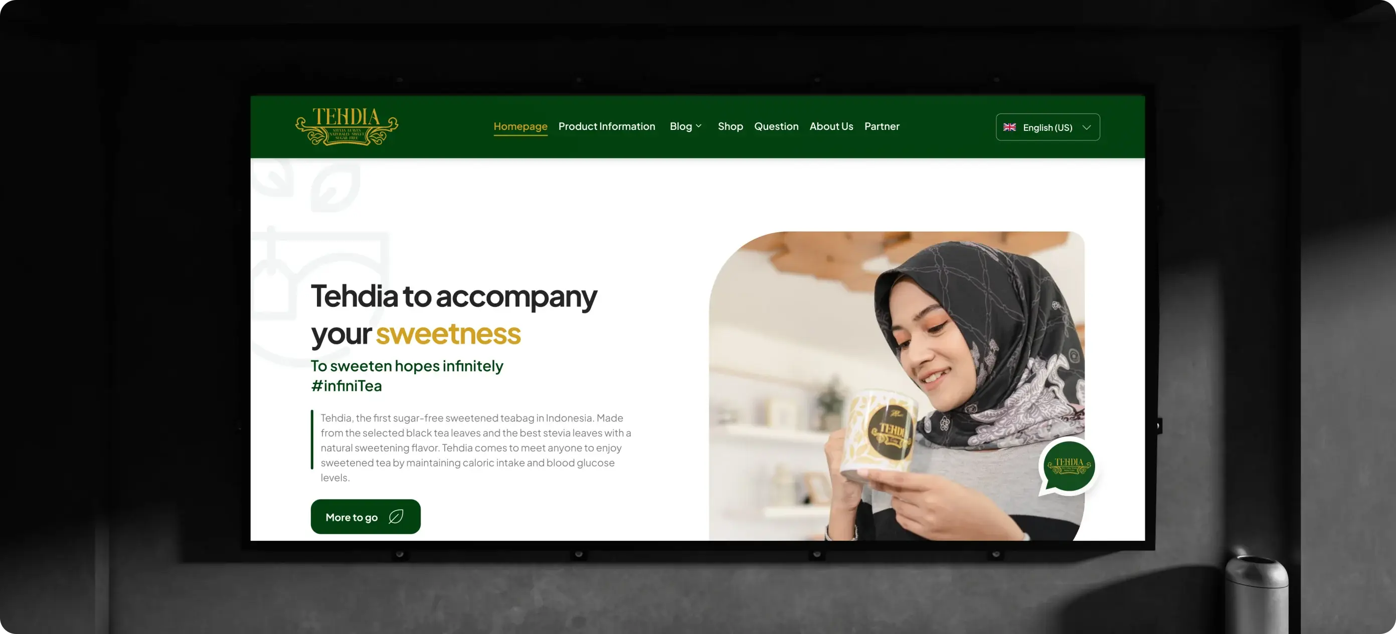
Realizing that the TEHDIA website currently does not fully reflect the superior quality of its premium tea products, there are functional discrepancies that hinder the user experience. The main focus is on fluidity: redesigning this platform to ensure that the interface and interactions are highly intuitive and accessible, thereby creating a memorable digital experience that effectively communicates the luxury, authenticity, and trust that are the core promises of the TEHDIA brand.
Objective
Redesign the Website and CMS to achieve "Seamlessness" — that is, highly intuitive (highly usable) and memorable interactions — to effectively communicate TEHDIA's premium value.
Problem
The Challenge
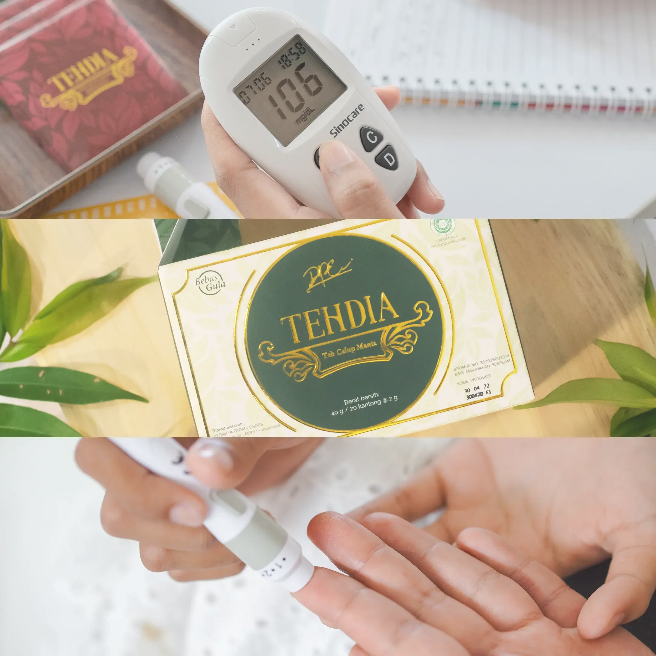
Before the redesign, the website faced key issues:
- [001] Visual & Aesthetic Challenges: a look that lacks premium quality and does not reflect the product's quality.
- [002] Usability & Clarity Challenges: non-intuitive interactions, making it difficult for users to access information.
- [003] Information Hierarchy Challenges: an illogical information structure, hindering the flow of discovering products and articles.
Output
The Solutions
- [001] Reorganization of Information Architecture (IA): ensuring a logical content discovery flow.
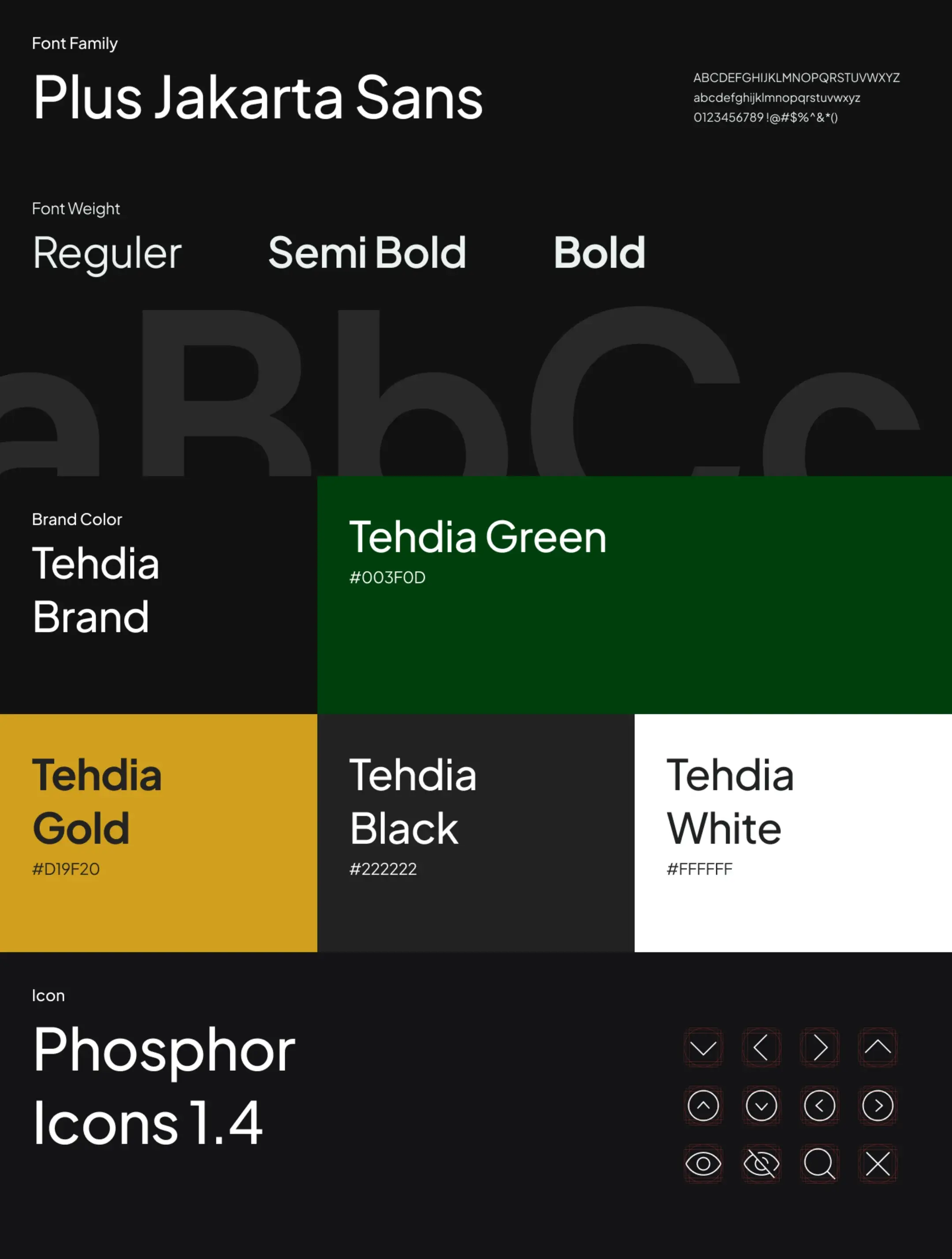
- [002] Visual Audit & Brand Disparity: creating a Design System for premium visual consistency.
- [003] Elevation of UI Components & Clear CTAs: clarifying user interaction guidelines.
- [004] Improvement of Crucial Content Usability: making content modules more scannable and easier to consume.